
Earlwood Logo Inverse Mono CMYK
Earlwood is a boutique residential land estate in the Hunter Valley, developed by Johnson Property Group. The blocks are generous and the setting is peaceful, surrounded by open landscape and the quieter pace of rural life. It is not a project defined by scale or spectacle. Its appeal is more considered than that.

The challenge was to find what that appeal genuinely was, and then build a brand around it that would connect with the right buyers for the right reasons.

Understanding who this place was really for

Demographics tell you who is looking. Values tell you why they choose. For Earlwood, we went beyond age, income and household size to understand what the ideal resident genuinely cared about at a deeper level.

What we found was a buyer who placed high value on benevolence, a sense of loyalty, honesty and meaning in everyday life. On universalism: a connection to nature, inner harmony and a broadminded view of the world. And on tradition: family, humility and a respect for the things that endure.

Equally important was what they did not value. Achievement in the conventional sense, status, social recognition and the accumulation of influence were low priorities. This was not a buyer trying to prove something. They were looking for a life that felt right, not one that looked impressive.

That distinction shaped everything. It told us not only what the brand needed to be, but what it needed to avoid. A brand that leaned into prestige, exclusivity or aspiration in the conventional sense would have spoken past this buyer entirely.

Building the brand

With that understanding as the foundation, we developed a brand that was grounded, natural and quietly assured. Not modest, but not loud. The visual identity reflected the landscape and the lifestyle without romanticising either. The voice was warm, honest and unhurried.

The brand narrative was written for the buyer who was not looking for a destination. They were looking for a place to belong.

When there is an abundance of space, time, simplicity and peace in our lives, we find closeness, connection and love. We find home, and grow together.

Bringing it to life

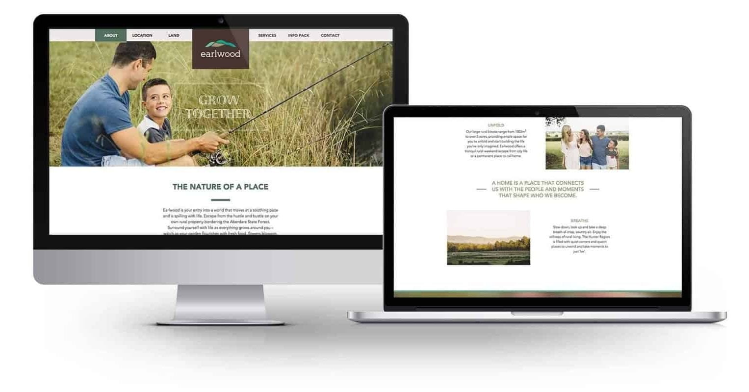
The brand needed to work across every point where a buyer encountered the project: the website, the signage, the print collateral, the sales centre experience and the ongoing content and communications. Each of those touchpoints was an opportunity to either reinforce the connection or undermine it.
We worked with the JPG marketing and sales team to ensure consistency across all of them, from the way the estate was presented physically to the tone of every piece of digital communication. Knowing the buyer well enough to anticipate what they needed, rather than simply responding to what they asked for, is what allowed the brand to feel genuinely considered rather than just well-designed.
Earlwood website full width row image@2x scaled e1776359583372
"Mezzanine has been a key part of Johnson Property Group’s family as our creative consultancy for many years. As our company has grown so have our needs and Mezzanine has continuously delivered.

A creative agency isn’t the best descriptor for Mezzanine, as they deliver so much more than beautiful creative. Their team has developed the clever skill of pulling-out and articulating our many brand stories, aligning them to our core strategy and creatively communicating them across all channels and client touch points.

Our long relationship with Mezzanine has been one of collaboration and collectively working towards our desired outcome, having a lot of fun along the way."
Braden johnson
Braden Johnson
Deputy MD, Johnson Property Group
Case Studies
SPCC_feature image 1
St Philip's Christian Education
Discover how a visionary educational institution transformed its brand to reflect a lifelong commitment to learning and community engagement. This case study reveals the journey of aligning purpose with practice, inspiring students and educators to embrace the whole of life.
Fabritecture core image- Brand Identity
Fabritecture
Redefining an establish international brand with purpose and vision. A blend of innovation, sustainability, and humanity—empowering connection, iconic structures, and limitless possibilities to reshape the future of architecture.
topblokes-cs-feature
Top Blokes Foundation
A bold, purpose-driven identity inspiring young men, strengthening connections, and empowering communities to lead cultural change and transform futures across Australia.
Renewable electricity technician at work
Think Regional
Redefining the future of regional careers, it breaks barriers and bridges communities, proving that opportunity thrives far beyond the city limits—where vibrant industries, innovative talent, and meaningful connections come together to create a new narrative for regional Australia.
Group of journalists with cameras filming individuals at a press event with Smart Energy Council branding - newcastle brand, Marketing consultants Newcastle, Market research Newcastle
Smart Energy Council
After 65 years the Smart Energy Council recognised that while their people were progressive and bold advocates within the industry, the perceptions being reinforced by their brand were preventing them from growing and scaling their voice and influence within the industry.
2023_West-Coast-Celtic_highlights_22.jpeg
Steiner Education Australia
Crafting a visionary brand that honours a legacy of excellence, inspires trust, and leads the industry into a bold new future.
An image of 4 women smiling at each other- Branding Newcastle, Newcastle branding
Australians Investing in Women
‘Australians Investing in Women’ invite all funders and investors across our country who believe in the importance of empowering women and girls to join them in empowering giving for a fairer future.
image1of6@2x
Business Sales
‘Business Sales’ vision for the future of the Australian small business industry was ambitious, but so are they.
Mezz-LJ-Feature
Leah Jay
Leah Jay is the Hunter’s leading property management company and were the first to pioneer as a specialist property management service in Australia over 20 years ago.
PRELUDE-0223-8300 extended
Prelude Australia
What do you do when you’ve been delivering best-practice, high quality services to the community for over 40 years, but your brand is creating uncertainty for potential employees and clients from the outside-in?