Establishing a connected brand for a new era in retirement living
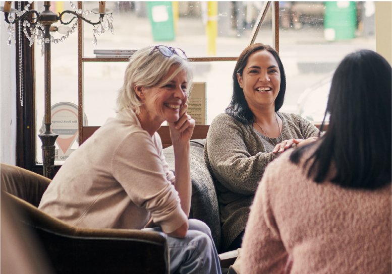
Working with people who really care about what they do and the people they serve is so important to us. When we saw Jamie, the Managing Director of Teman, taking the bins out for a resident at one of his communities, we knew we’d get along well.
So often we meet CEO’s and business owners who have deep-seated values and are operating in ways that are so unique and different in their industry, but perhaps don’t even realise themselves how valuable that is. Sometimes all you need to do is bottle that gold up and share it in a way that connects and engages people.
To grow and scale you have to be able to convey your difference, where you’re going and the values you stand by. It’s these things that inspire people to get on board – both customers and employees.
Teman was faced with the challenge of successfully transitioning from two communities to owning seven communities across Australia within months. The corporate organisation needed to establish its own brand, while simultaneously building a suite of connected brands for all of its communities.
Clarity
We needed to uncover and understand what was unique about Teman and the way they operated.
We did all the normal things like workshops and conversations with the Teman team, but the real insight came from observing Jamie and his staff, and talking to residents in the communities. The stories we heard were the catalyst for the brand strategy that was developed.
The best brands are authentic, values-led and based on real purpose, not some clever facade made-up by an agency. We uncover what’s true and unique, put structure and strategy behind it so it becomes intentional, and then express it in engaging, genuine and inspiring ways.
Building the Brand System
The challenge when building the Teman brand was that all future communities had to be considered – we needed to build an overarching brand for the organisation that was well-considered and multi-layered to ensure both current and possible future communities could be grown from the core brand and reflect the values of the organisation. In addition, each community brand also needed to own its unique differences, geographically and physically.
We exist to enable belonging and friendship in later life
- Vision
At Teman, we believe everyone deserves to enjoy their life and have access to a lifestyle that brings them contentment and happiness as they grow older. We strive to lead the way in equality and fairness in mature-age living and pride ourselves on being a friendly organisation with an aspiration to create the most welcoming, service-led communities in Australia.
- Personality
Our brand personality is real, empathetic with a lack of pretense. We don’t try to stand out from the crowd, rather we show our residents that we are exactly like them – humble, hard working and straightforward. Our personality should give residents a sense of acceptance and belonging just as they are – no ‘bells and whistles’ required.
- Voice
Our voice is friendly, humble, honest and practical. We don’t over-analyse or complicate, we speak plain language in a straightforward manner. Our communications are relatable to our audience and should feel as though they’re coming from a friend. Our tone is welcoming and warm.
Community brands
Brand elements like a suite of unique shapes and a distinguishable language, along with a universal colour system and imagery created congruency with the core brand. Individual colour palettes, unique key messages and hero images allowed differentiation between the community brands.
Here are some ideas we explored:
- Each community brand will be derived from the Teman strategic direction and feel related, both visually and strategically
- Investigate using a suite of organic shapes that are arranged uniquely to build visual icons for each village that represent the unique and differentiating value prop of the community. Like the idea behind tangrams… we would need to ensure they are simple, friendly and a little abstract without feeling childish in any way. A more natural, mature/ down to earth palette will help with this and align with our Everyman archetype.
- Build a universal (broad) colour palette for Teman communities, and each community brand will draw on a unique section of the palette – the tones that best represent that communities unique differences. (eg. coastal villages to utilise the cooler shades etc).
- Potentially create a treatment for the organic shapes to add differentiation
We needed to look at the demographics, village features, and surrounding location for each of the communities. From our research, we drew out the unique value proposition for each community to guide individual brand development. This all had to be considered upfront to ensure brand elements were created that worked both functionally and strategically across the board.