- Brand Consulting
- Brand Strategy
- Brand Identity System
- Australia
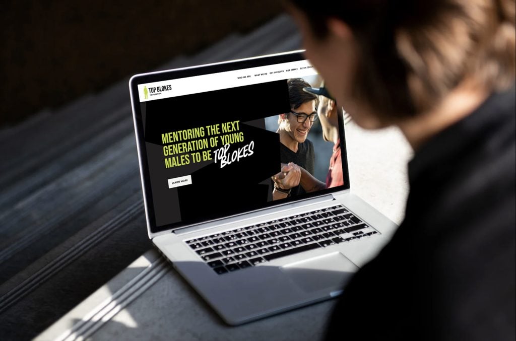
Top Blokes Foundation is a leading organisation empowering young men across Australia to lead healthier and safer lives. Recognising their growing national impact, they partnered with Mezzanine in 2023 to evolve their brand strategy and visual identity. The goal was to align their purpose, championing resilience, empathy, and leadership, with a more professional and relatable brand system. Through workshops with their leadership team, we uncovered their unique strengths, refining their purpose and values while modernising their visual identity. The result was a cohesive and inspiring brand that resonates deeply with participants and stakeholders, fostering pride and connection within the Top Blokes community.
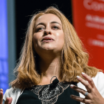
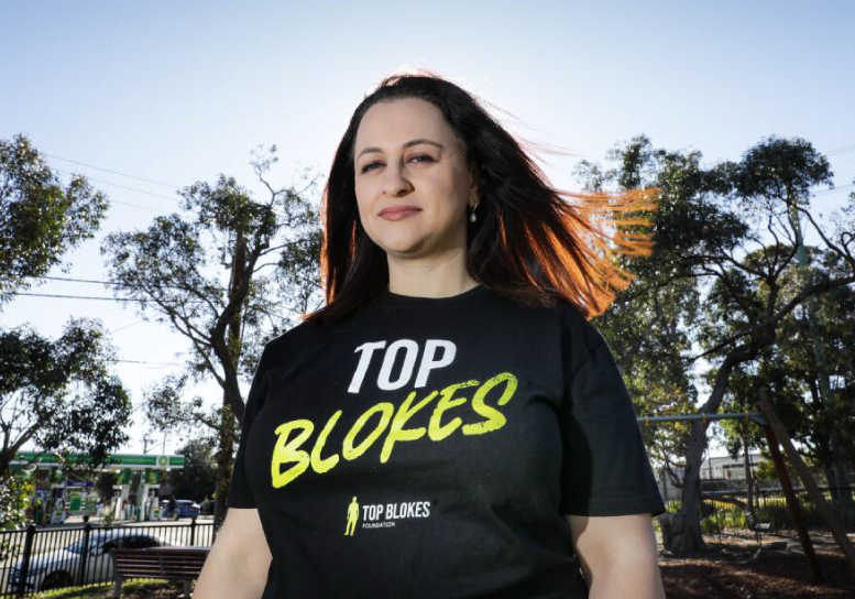
At 19, Melissa Abu-Gazaleh, founder and managing director of Top Blokes Foundation, noticed so many young men around her masking their pain and mental health issues through drugs, alcohol, risk-taking and self-harm. Alarmed by the high rates of youth crime, alcohol-related violence, and suicide among young men, Melissa saw an urgent need to enhance their social and emotional wellbeing.
“It’s always been about empowering young males to discover their inner strength.”
The Challenge:
Evolving a Trusted Brand for Growth
The leadership team at Top Blokes recognised the need for their brand to better reflect their national presence, grassroots impact, and commitment to empowering young men. While their existing brand system carried significant meaning, it lacked the depth, memorability, and professional polish required to solidify their position as a leader in their field.
One of the challenges was to create a cohesive strategy and updated identity that would resonate with their diverse stakeholders, young men aged 10–24, their families, schools, and the Top Blokes supporters.
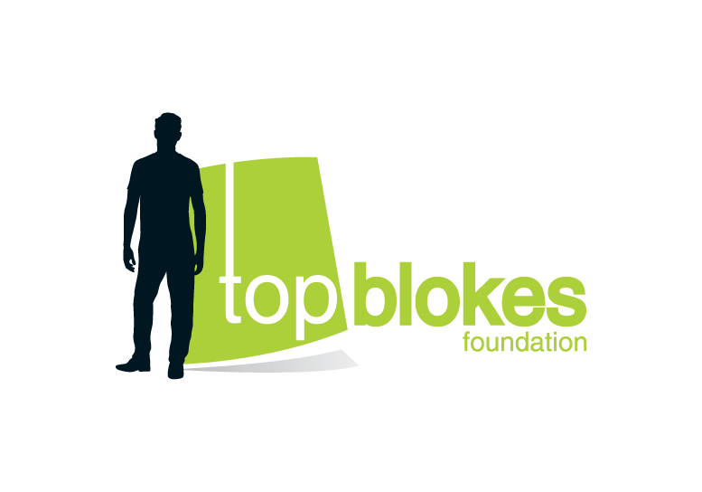
The evolution of their visual identity required careful navigation. Top Blokes wanted to honour their brand’s history and retain the essence of their original logo, ensuring continuity and recognition. At the same time, the updated visuals needed to connect more deeply with participants, giving them a sense of pride and belonging while presenting a contemporary, relatable, and inspiring face to the world .
Our Approach:
A Purpose-Driven Collaboration
To address these challenges, Mezzanine embarked on a journey of discovery and co-creation with Top Blokes, starting with leadership workshops designed to uncover the organisation’s core strengths, values, and aspirations. These sessions helped refine their purpose “to help more young men lead healthy and safe lives” and articulated a future vision where masculinity becomes a force for good. Together, we explored what set Top Blokes apart, from their grassroots approach to their focus on long-term, evidence-based impact. These insights became the foundation of their revitalised brand strategy .
The visual identity was approached with care, balancing evolution with innovation. The leadership team’s desire to stay connected to their existing logo led us to refine, rather than replace, the key elements. The updated logo retained the iconic male figure, originally depicted in a suit but later adapted for relatability. We modernised this element, making it feel more inclusive, approachable, and aligned with the experiences of young men today. The design also introduced a more dynamic composition, enhancing its usability across various applications while reflecting the organisation’s maturity and growth .
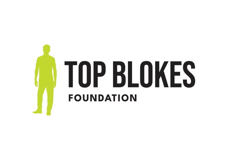
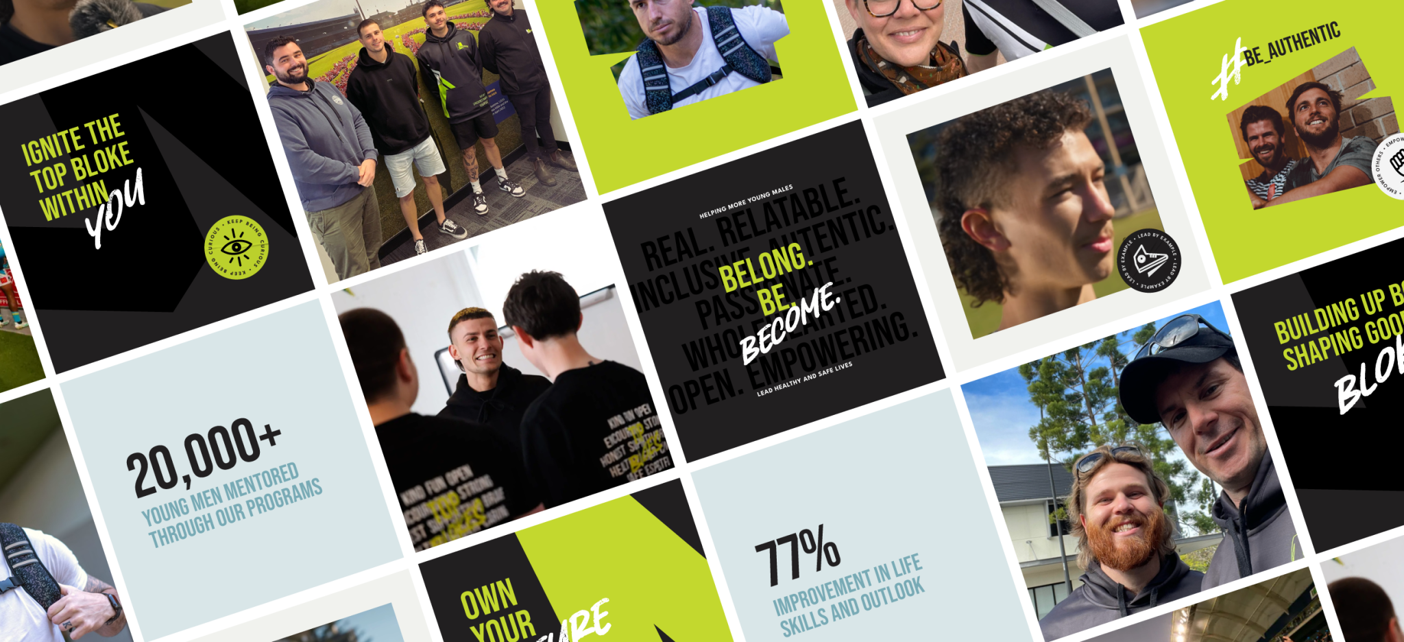
The colour palette was thoughtfully expanded, building on their signature green to include complementary shades of blue and grey. This blend symbolised growth, trust, and stability, while also appealing to their audience. Typography was updated to include bold, confident fonts for headlines paired with friendly, accessible typefaces for body text. This combination communicated strength and approachability, qualities central to Top Blokes’ personality.
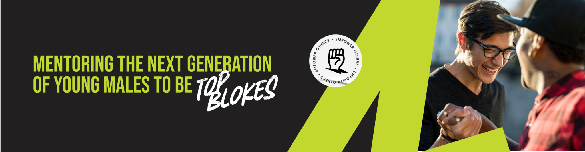
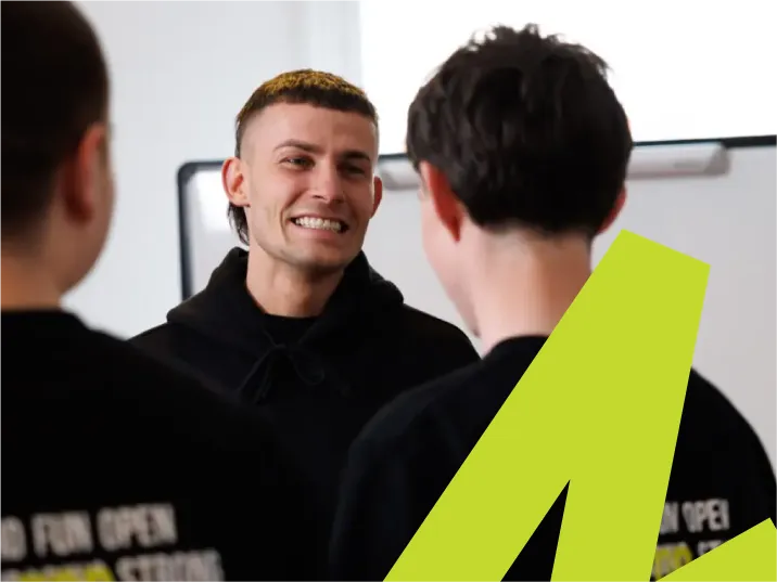
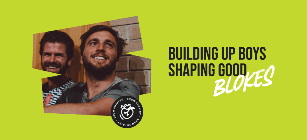
Imagery played a crucial role in the refreshed visual system. We prioritised authentic, real-world photos that showcased the diversity and strength of the young men they serve. These images were designed to capture moments of connection, growth, and camaraderie, moving away from over-polished or staged visuals that could feel corporate or distant. By grounding the visual identity in the lives of real participants, we reinforced the message that Top Blokes is part of the community it serves.
Storytelling also became a key pillar of the brand. We crafted narratives that positioned Top Blokes as mentors and changemakers, breaking down stereotypes and redefining strength as resilience and empathy. This approach ensured that their messaging resonated not only with participants but also with families, schools, and community stakeholders.
The Outcome:
Building a Stronger Brand for Impact
The collaboration resulted in a brand strategy and visual identity that seamlessly integrated Top Blokes’ purpose, vision, and audience engagement. The evolved logo retained its familiarity while gaining a contemporary edge, striking a balance between tradition and progress. Participants and stakeholders alike responded positively to the updated visuals, with many expressing pride in being part of the Top Blokes community.
The refreshed brand gave Top Blokes a cohesive system that could be applied consistently across all platforms, from digital assets to on-the-ground program materials. This consistency reinforced their credibility and helped deepen emotional connections with their audience. As a result, the Foundation saw increased recognition and engagement, with schools, parents, and young men feeling more aligned with the brand’s message and mission.
Feedback from participants and their families highlighted the transformative power of the updated brand. One parent noted, “I’ve seen my son become more empathetic and confident, something I didn’t think was possible before this program” . For the young men themselves, the new visual identity created a sense of ownership and pride, aligning with Top Blokes’ goal of fostering leadership and belonging.